Rich quickly got us oriented in the use environment
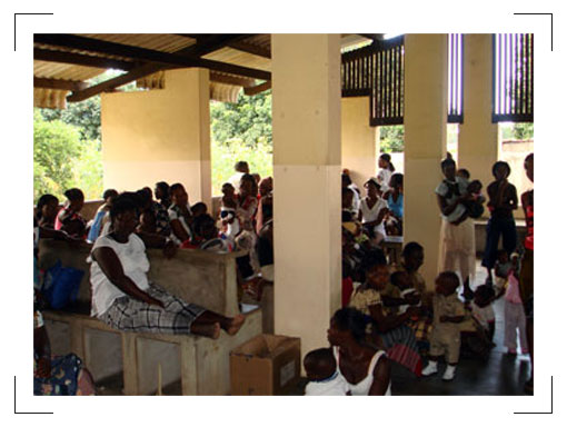
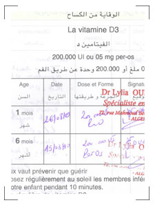
From years of travel to the developing world, Rich shared pictures, narrative, and anecdotes that helped us to understand the challenges we would be facing in designing a new health record system.
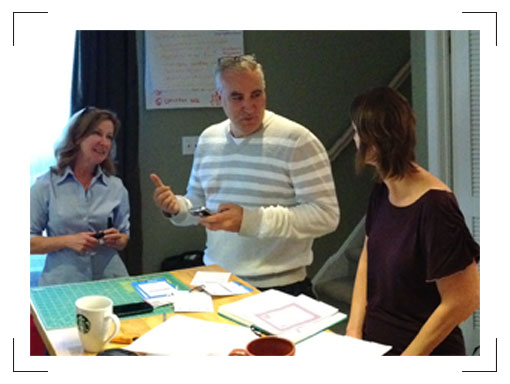
Over bagels in Matchstick HQ one Saturday morning, Rich brought his photos from working in Africa and immersed us in his experiences. He focused our attention on the challenges highlighted. These records would face extreme weather and moisture, dust and dirt from long treks to and from the health clinic, hazards in storage, chance of loss, and the temptation to repurpose elements of the system for some other need. Feeling immersed, we began to set out our design goals, using the information provided by the Gates Foundation as a framework.
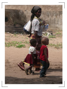
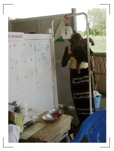
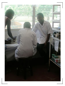
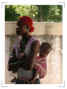
From there, we studied existing vaccine records and made crude prototypes
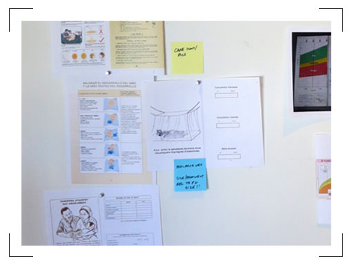
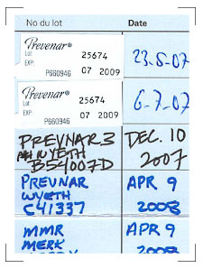
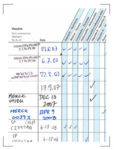
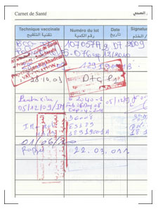
We became engrossed in the vaccine records themselves, pinning dozens up to foam boards. Some were full color, others black and white. Some were simple and to the point; others were detailed and had every usable inch crammed with material. Some folded, some did not; some were large and others smaller.
The team quickly converged around three big issues:
- What were the potential durable materials that would improve the paper experience while keeping the simplicity?
- How could we focus the primary audiences – parents and health workers – to the appropriate information that they needed to get from the health records?
- How could we include all of the necessary information, and yet make the record easily extensible for new vaccines and other localized health information?
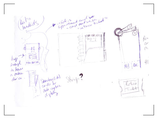
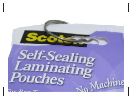
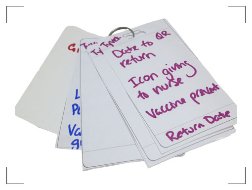
As our idea evolved into the Carousel concept of cards on a ring, what should the right binding be? Rich made it clear that any material that could be repurposed for another use would be repurposed. We wanted to ensure that our record stayed intact.
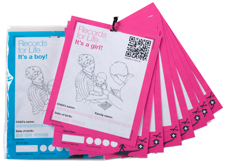
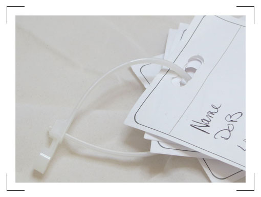
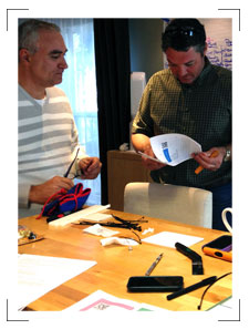
The results were some crude prototypes that we bound with zip ties, to demonstrate proof of concept. We were still evaluating the information that should be included. Our guiding principle was to include what was necessary, and nothing more. These prototypes enabled us to envision how the information should be presented, and led to our idea for dedicating one side of each card to the parent, and the other side to the health worker.
Even as we designed a better analog record we knew it would be important to address digitization.
Handwriting and notes became issues to address as we considered this process.
As we worked through the early prototypes, we went back to the repository and the internet. How could we easily translate handwritten documents into digital? What are ways to encourage neat writing for data capture?
From the start, we built in support for Captricity, an elegant analog-to-digital solution created and proven in the developing world.
We know the folks at Captricity and have used their technology on various client projects. Although our work with them was in the US, we knew the technology was originally invented to capture data in the field in the developing world. It was the perfect choice for our design.
The tool is simple and flexible, and would easily capture paper health information and convert it to digital form, without the need for creating expensive infrastructure.
Kuang Chen shared pictures from his trips to Africa, where he was inspired to create Captricity. As with Rich’s immersion, we started to get a sense for the constraints and challenges associated with digitization.
Having refined the design of the prototype, we designed in the features that would improve Captricity’s accuracy on the captured, handwritten pages. Andrea Spillmann gave us great pointers on how to best accomplish this.
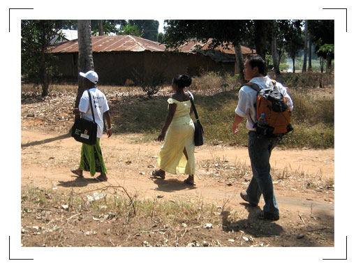
Captricity founder Kuang Chen (right). While doing research in Tanzania and Uganda, he experienced firsthand the importance and difficulty of transforming data from paper forms to computable formats.
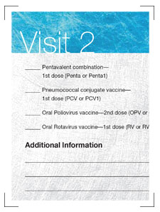
Original Concept
Our original concept had simple straight writing lines, much like most of the records in the repository. As we saw earlier, this led to sloppy handwriting that was illegible.
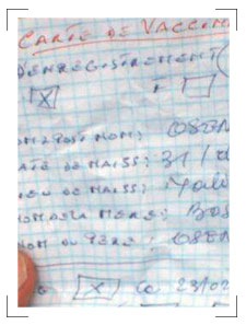
Vaccine Record Repository
One thing we noticed when we looked at the repository was this hand-written example, probably created when a printed record wasn’t available. We noticed how the lettering at the top was neater, and almost “in the boxes.”
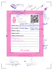
Card Design Iterations
We worked through various alternatives to improve digitization accuracy. The folks at Captricity gave us useful feedback, and Jen incorporated these features directly into the design.
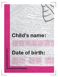
Final Carousel Cards
The final cards reflect Captricity best practices, build on our observations from existing records in the repository, and maximize capture accuracy for future digitization.
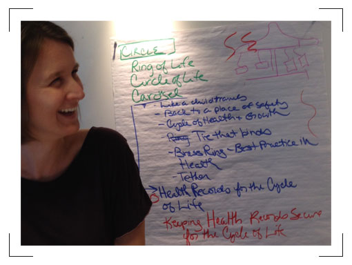
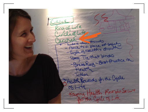
As our prototype took shape, we knew our idea needed a name. Erika ran a creative thinking session to help us come up with some good ideas.
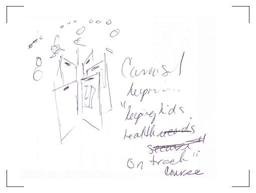
Erika and Marty routinely use Edward de Bono’s Six Thinking Hats and Lateral Thinking tools in their consulting work, to help generate really creative ideas. We used the “random entry” tool to come up with various ideas to name our concept of cards spinning on a ring. After a number of really off-the-wall ideas, we converged on “Carousel.” It immediately felt right. The name was whimsical, reflected the actual record design, and had a link to the beloved kids’ ride.
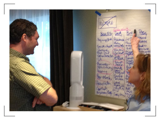
We pored over every design detail.
As we refined the prototypes, we kept going over each and every detail. The card size? We chose a common metric increment, to maximize the number of cards from each sheet of paper.
Rich experimented with the best way to shrink-wrap the cards to keep them together in sets during shipment to the developing world and maximize shipping density.
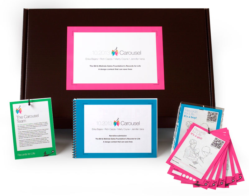
He led an exploration on how to connect the Carousel cards – we tried bolts, cable ties, wire ties, and the like. We included a number of options in addition to zip ties in our submission. The key was to avoid materials that would be taken and repurposed.
What if a family had more than one child? We’d color code the cards, so that multiple decks for different kids could be zip tied together for a “family pack.”
We translated every element possible into visual graphics, minimizing the need for words.
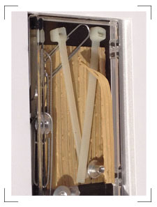
Rich, wanting to make sure no educational opportunity was lost, had another idea from past experience.
We added a simple, low-tech flipbook from Flippies that can simply deliver pictorial information and was also proven in the developing world.
Flippies fit our theme perfectly. It’s like a kid’s animation book, delivering a high-quality educational experience without expensive technology.
We finalized the prototype and “packaged” our card sets.
We wanted to create an actual physical prototype for our submission. We printed and collected the various elements of our health record system, and packaged them in a display box for the judges. We felt that seeing the actual prototype would provide a much better sense of how we envisioned our system working.
Not only was it great to get friends back together and work with people that have synergy, but it was exciting to do something good that others can take and be inspired by, work to improve, and perhaps use to improve vaccination coverage. We’re grateful for the opportunity the Gates Foundation gave us, and to Jen for bringing the group back together to do work we are all proud of.
