Carousel Design Elements
When we took the insights and experiences Rich shared, combined them with the information from the Foundation and asked, “so what,” the challenges became apparent. How might we:
- Ensure the records are durable, but mobile and light?
- Create a record that was nice, but not so nice that people would be tempted to disassemble and repurpose the components?
- Encourage people to use it the right way to avoid record-keeping mistakes?
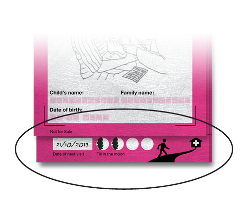
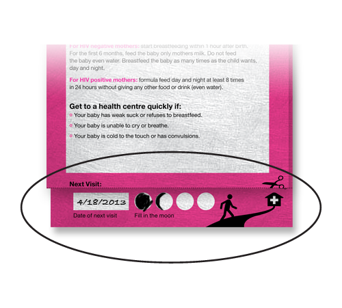
- Focus the user’s attention on the important information to keep vaccination dates and visits top-of-mind?
- Rely on visual versus text-heavy communication to address language and literacy issues?
- Convey the right amount of information without confusing the users?
- Make it easily stored in a place where it wouldn’t be forgotten?
- Ensure that the record clearly shows which vaccines have already been given, and which are still required?
- Help health workers explain the importance of keeping and maintaining health records to parents?
- Enable easy transition to a digital system, without completely revamping a simple analog system to do so?
What are the unique aspects of Carousel?
Materials that are flexible and durable, but enable the record to stay intact
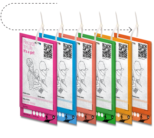
We replaced a simple, paper analog system with Tyvek® cards bound by zip ties. Our design uses materials that are very low cost, simple, virtually indestructible, and survive in a variety of conditions from wet to dry, misty to dusty, and cold to hot. The system addresses the weakness of paper while retaining its functionality, low cost, and versatility.
The Tyvek material is strong enough to survive the use environment without being so strong that it is appropriated for other uses, such as improvised repairs. We liked the idea of being able to inexpensively add pages to accommodate needs of individual countries, regions, or vaccine campaigns.
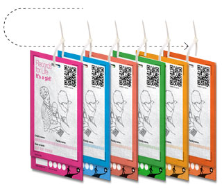
We used a simple zip tie to bind the Carousel cards together. It is difficult to remove and has no alternative use – it’s destroyed in the process of removing it – but is low cost. This encourages parents and health workers to keep Carousel cards together. The zip tie can also be used to bind a full family’s records together.
Better information design to address confusing aspects of current printed records
For Health Workers
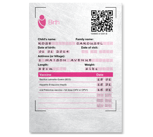
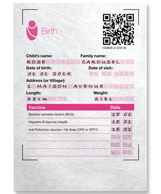
We replaced words and confusing writable spaces on existing records with a colorful and visual design for presenting information. By splitting complicated tables with inadequate writing space into multiple pages, we preserved the information that health workers expect to see while keeping the record compact.
Instead of a massive grid chart, information is manageable and tied to a specific milestone. Attention is focused only on the visit at hand. On an individual card, the information is organized in much the same way as records provided today, so health workers see what they are expecting and have come to know. Simple icons, illustrations, and clearly marked writing spaces make it easy to complete correctly.
For Parents & Caregivers
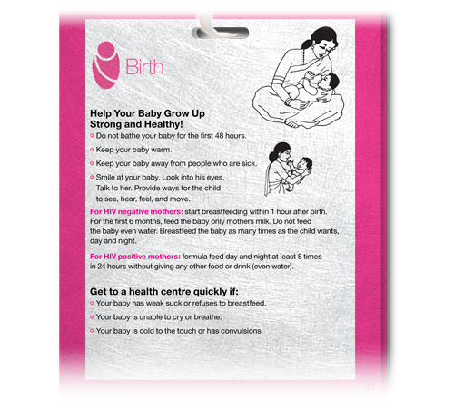
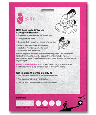
In analyzing existing records, a big insight was that information was shoehorned, pushed to the margins, and lacked an obvious relationship to developmental milestones. We designed Carousel to focus caregiver attention on the educational messages relevant at each milestone.
For parents, we separated the relevant milestone care information to the front of the card deck, so it’s always visible.
Educational “surround” to improve effectiveness of health worker interactions with caregivers
We provided an optional training aid to help healthcare workers and parents understand how to use the Carousel system. We chose Flippies flipbooks. Flippies are low-tech, simple interactive tools that remind us of the kids’ do-it-yourself cartoon books. Rich used them to educate clinicians in the past.
We thought these would provide an engaging, low-cost and simple way to train parents and health workers about Carousel in the field, avoiding literacy and language barriers.
Support for digitization, now or in the future, without complicated infrastructure or high cost
 Support for Digitization on Demand with Captricity
We started designing Carousel with digitization in mind. We asked ourselves how we could make an analog system become digital without compromising simplicity or cost, or requiring extensive infrastructure.
We designed Carousel to easily integrate with Captricity, a technology that captures static data from paper documents and converts it into digital. We worked with Captricity to incorporate features that would improve accuracy and ease digitization.
The best part about Captricity is that it’s optional to use and can be done at any time. The features are there, but invisible to users of the “plain” paper record. To use the built-in Captricity capability, no mobile devices or expensive infrastructure are needed; images can be submitted for processing using a simple digital camera.
Captricity was created in the developing world and has already been proven accurate and reliable in studies conducted in Kenya and Mali. We liked that it already had API integrations built with OpenMRS, a medical record system used in the developing world.
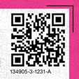 QR Codes Embed Information About Individual Carousel Cards and Decks
QR codes are provided on each page of Carousel. They are supported by Captricity, and provide a robust way to capture data regarding the health record. QR codes have a public, well-defined standard, and provide for error correction through data redundancy, which allows for readability of the data even if portions of the printing become scratched off or damaged.
The QR could store:
- Serialization (a unique identifier per card set at printing)
- Page number in card set (likely linked to serialization)
- Time milestone (birth, 3 months, 6 months, etc.)
- Versioning information (card set version)
- Localization information (country, region specific information)
- Campaign information (vaccination wave, health authority or NGO, etc.)
- Card “gender” (boy or girl)
- Page serialization (if specific one-off add on card)
- Nation/region specific information (customizable data overhead provision)

